Muddy March Leaves - Final Edit
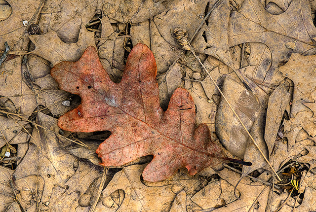
I liked "Muddy March Leaves" (see the post before this one) enough to print it... and that kicks off the cycles of editing and re-editing the image. Here's the final image (click on it for a larger file):
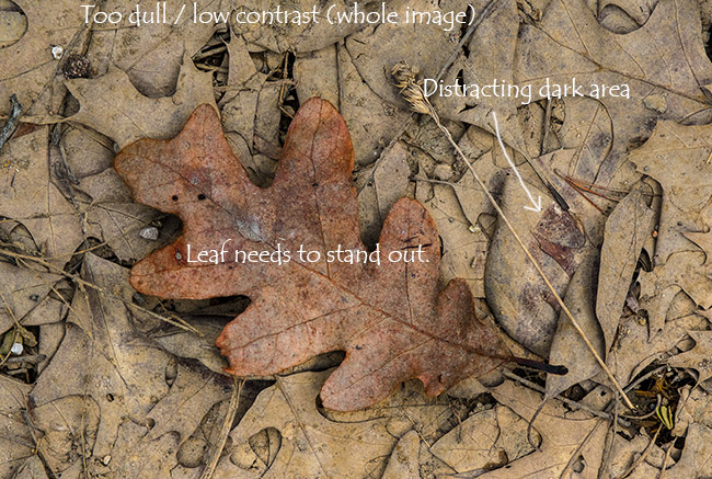
And here is the original image, annotated to highlight what needed to be improved:
In making the first image, I made basic adjustments to the raw file and tiff, and then tonemapped the resulting image in Photomatix. I "dialed down" the settings in Photomatix to avoid an overly processed looked, and further muted the effect by blending the original and the tone mapped images as Photoshop layers. In this case I set the opacity of the tone mapped layer to 30%, so original layer remained the core of the image. The idea is simply coax out more detail and better manage the overall contrast levels, while preserving the natural look in the image.
In this case I decided that I had dialed down the tone mapping too much, so in the revised image I increased the opacity of the tone mapped layer considerably, which brought out a lot more contrast in the overall image.
Next, I wanted to make the reddish leaf stand out more. I masked out the leaf using the quick mask tool in Photoshop CS6 and then adjusted the saturation settings of each of the individual sliders, putting emphasis on the reds. I then inverted the mask and adjusted the sliders for the background, but muted colors and drew out the yellowish tones some more. As with the tone mapping process, I tried to tread lightly with the settings and only adjust the color tones by a few percent either way.
Lastly, the annoying dark area need to be addressed. I made another layer within Photoshop and set the blend mode to lighten. I then used the eyedropper to select a muddy yellow tone from the leaves that were washed with mud, and used the brush tool set to 10% opacity to wash the muddy tones over the darker leaves. With the layer blending set to lighten, the wash pretty much filled in only the darker leaves. I picked multiple shades of the muddy colors and painted randomly over the darker leaves to avoid creating a uniform "filled in" look over them. Finally, I ran the sponge tool set to desaturate, flow set to 10, over some of the bright areas of the pine needles to mute the colors that were still coming through.
I think that these few subtle changes really improves the image, and as a large print it has a lot more presence with these enhancements.
2 comments
Comment from: Lillian Visitor
Comment from: mark Member

Thanks, Lillian! I think this photo was made using version 5.0.4 of Photomatix but there has been at least one update since. I try to keep it up to date and the license has thus far allowed for updates at no cost.


Nice work!!very good! What version of Photomatix have you been using??
Im going to buy Photomatix Pro 5 and just started using http://macphun.com/noiseless tools (also). The process is relatively simple for now..