Posted by mark on Apr 23 2015 in Allegan Forest, Focus Stacking, Extreme Macro
Posted by mark on Apr 20 2015 in Wildflowers
Spring has been building momentum as the days get longer and warmer, and with it the succession of spring ephemeral wildflowers continues to unfold. Visiting the woods last Friday revealed several newly emerging species. Spring Beauty and False Rue Anemone are blooming in abundance, literally carpeting the ground in some places. The Trout Lily has commenced blooming and is present in growing numbers, Marsh Marigolds are abundant and even a few Trillium have begun to flower. Meanwhile the hepatica are growing scarce and the Bloodroot flowers are becoming less common.
Here's a photo of Spring Beauty - Claytonia virginica (click on the image for a larger file):
Hepatica is fading. A few weeks ago it and Harbinger of Spring were the only flowers in the woods. Now, the once abundant Hepatica is almost gone. Here is a white Hepatica bloom:
Trout Lily - Erythronium americanu - is now emerging and will probably peak in the next few days (at least at this particular location.)
Trout Lilies can be challenging to photograph - the flowers are beautiful but nod down from a fairly short stem, just a few inches above the ground. To get a clean background behind the flower the camera has be placed very low to the ground - actually aimed slightly upwards to put some distance between the flower and the background (which is inevitably a cluttered forest floor.) I've been keeping tabs on a small hillside that hosts a few Trout Lilies and would also allow the camera to be positioned beneath the flower - lower on the hillside - to help get the right angle. This year I arrived when one of the few Trout Lilies on the hill was blooming.
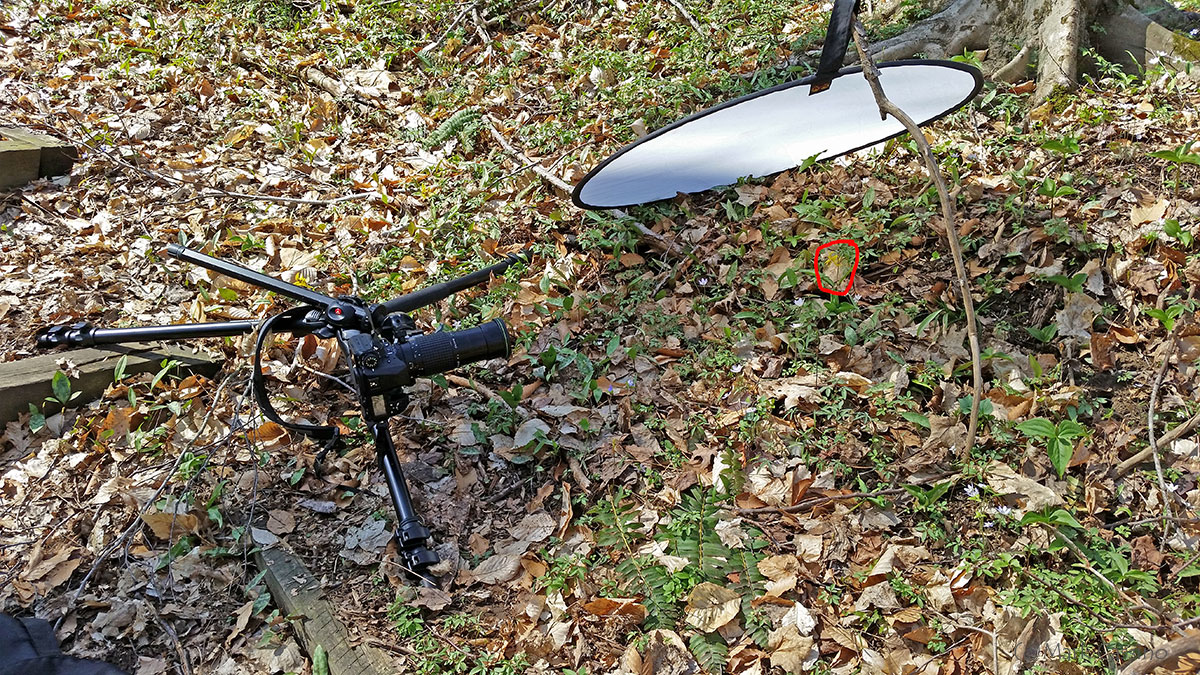
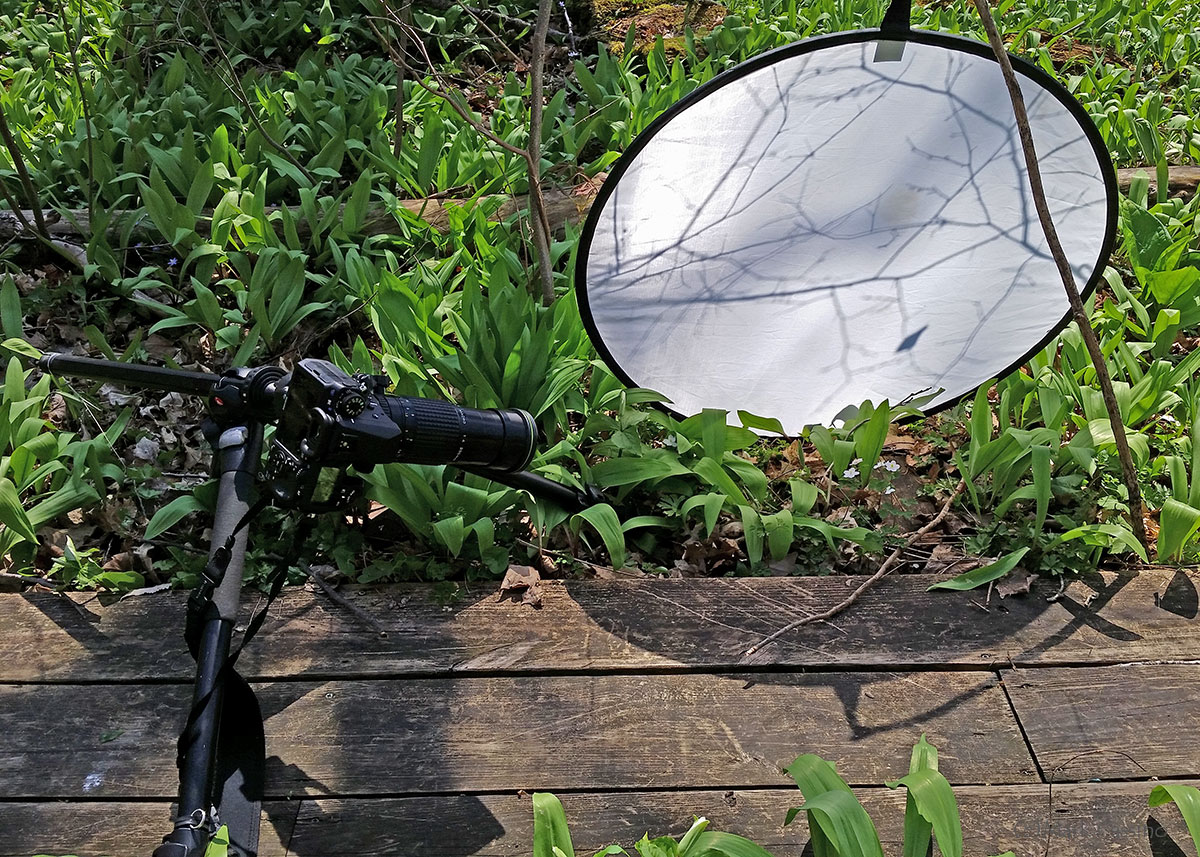
The lily was in bright and contrasty full sunlight, only slightly shadowed by the bare tree branches overhead. I used a diffuser, propped up by a handy stick to soften the light. Here's a cell phone snap of the setup used to make the above image:

I drew a red circle around the Trout Lily since it does not stand out in that photo. The camera is a Pentax K-3 with A* 200mm lf4 macro lens. The 200mm telephoto provides ample working room, especially for a larger subject like the Trout Lily.
False Rue Anemone - Enemion biternatum - is another newly emerging wildflower. Driving to the woods I passed some areas where this was literally carpeting the ground. A close up of a pair of blooms:
Here again the full-on sun necessitated using a diffuser.

Another False Rue Anemone:
Marsh Marigolds - Caltha palustris - have also emerged:
Lastly - hiking into the woods I ran into a small area where the Trillium -Trillium Grandiflorum - had started to bloom. It seems early - I think of the Trillium as starting to bloom towards the end of the spring wildflowers season. It seems to be arriving a little early - but then it was on a slight south facing hillside, and we have had a few warm and sunny days - so maybe it is just getting an early start.
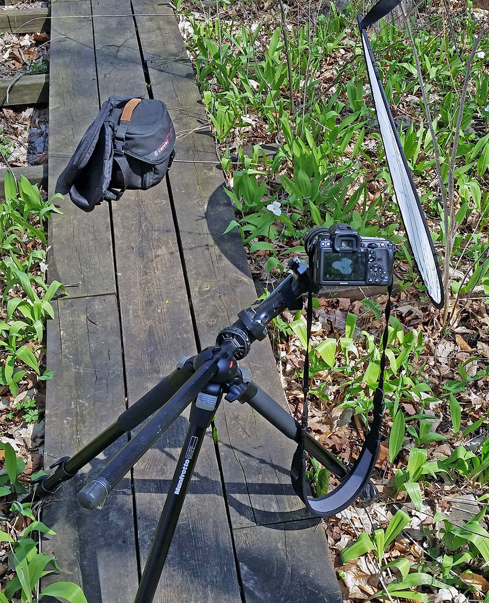
Here again, the diffuser was used to try to tame the direct sunlight - especially important with a bright white flower. In this case there was a small shrub, still leafless, that served as handy support for the diffuser. Here's another cell phone snapshot of the setup used for the photo above:

More spring wildflower photos will be coming in the days ahead.
Posted by mark on Apr 16 2015 in Wildflowers
A few more spring ephemeral wilflowers taken in Cass County, Michigan, earlier this week... First up - Dutchman's Britches - Dicentra cucullaria (click on the images for larger files):
Dutchman's Britches - Dicentra cucullaria
Another Bloodroot flower- Sanguinaria canadensis:
Bloodroot -Sanguinaria canadensis
Lastly - Hepatica remains abundant in the forest, though I expect they will fade away soon:
On this trip I noticed that the Harbinger of SPring is all but gone - just a few withering flowers remain. The spring beauty is starting to emerge and also the wood sorrell and false rue anenome. The season moves along very quickly - I hope he be back in the woods to catch the next wave of ephemeral whileflowers!
Posted by mark on Apr 15 2015 in Wildflowers
Bloodroot - Sanguinaria canadensis -one of the most beautiful of spring wildflowers (click on the iamge for a larger file):
Bloodroot seems to be the most fleeting of the spring ephemerals.... Unlike hepatica or spring beauty, which may bloom for a few weeks in any given location - most bootroots in any given location seem to bloom within a matter of a few days. The flowers last a few days at most and then are gone. If you mis them - well, there's always next year. How many times have I shown up hoping to find these flowers, only to be greeted by their leathery leaves, bereft of blooms.
So today I was lucky and stumbled into the woods at a time when the bloodroots were blooming like mad!
I spent a few hours in the woods, now lush with spring wildflowers (and lots of wild leek) - and I have a bit of material to comb through. But upon getting home wanted to be sure that I managed at least one passable bloodroot image - and this one seems to fit the bill.
More bloodroots and other spring ephemerals to follow n the next few days.
Posted by mark on Apr 13 2015 in Wildflowers
Last couple of hepatica from last week - time to go out and find some more!
Hepatica
Hepatica
Both of these are focus stacked exposures. The top image was combined in Photoshop CS6, the bottom image using Zerene Stacker. It's interesting that the two products can produce significantly different results, and neither seems to consistently outperform the other. For these wildflowers I've relied mostly on Photoshop, with 5 of the 7 wildflower images in recent posts combined in it. But for really large stacks, Zerene Stacker works much better.
Posted by mark on Apr 13 2015 in Macro Photography, Focus Stacking
My seventh attempt at a focus stacked studio macro photo and the first attempt simulating a natural setting.
I am not thrilled with this photo - after taking it I realized that the two hind legs are in an unnatural position and I also managed to damage the spider's right palps (the "boxing glove" like appendage.) I also did not get him cleaned up enough. But, it is still a step forward from my last attempt. This is a focus stack made from 153 separate images combined in Zerene Stacker.
Posted by mark on Apr 09 2015 in Wildflowers
Here are a few more photographs of spring wildflowers, taken earlier this week in Cass County, Michigan. The first four images are hepatica. These beautiful (although small) flowers can be found in a range of colors - as you can see in the photos which vary from purple to pink to creamy white.
The last photo is Harbinger of Spring (Erigenia bulbosa) also known as Salt and Pepper. This flower vies with skunk cabbage as one of the earliest flowers to appear on the forest floor. Click on the images for larger files.
Hepatica and Harbinger of Spring are spring ephemerals - wildflowers that exploit the few weeks in spring when full sunlight reaches the forest floor. These plants emerge to soak up energy from the sun before the trees leaf out and the forest canopy shades the ground. Individual plants have just a few short weeks (or even days) to build up energy, store it in their root system, flower and seed, and then go dormant again until the next spring. Spring ephemerals emerge in certain sequences - some species appearing earlier than others.
The Heaptica is just getting started and still to come are Spring Beauty, Trout Lily, Trillium and many more. Check out the wildflower gallery for selected wildflower images from prior years. For blog posts about hunting wildflowers in southwest Michigan starting in 2006 - see the wildflower catergory.
Posted by mark on Apr 06 2015 in Wildflowers, Wildflower Photography
A few warm days... it's April... time to check out the woods in Cass County and St. Joseph County - great places for spring ephemeral wildflowers. The snow just melted a week or so ago, but already the hepatica are stating to pop up. Here's one photo from today - a simple blue hepatica (click on the image for a larger file.)
Simple Blue Hepatica


